Lyra Health’s Microsite
Project Type
UX Design, Motion Design
Role
Sr UX Creative - Animation
Deliverables
Interactive components for the user experience and MP4 for hero header as a background.
Timeline
1 month
Problem
Make Lyra easier to navigate
The onboarding process had been linear and worked for a long time, but it became outdated as Lyra expanded to multiple offerings beyond provider-led care. An opportunity to make it easier to navigate and surface the expanded portfolio would modernize the experience and demonstrate value to all members.
Solution
A visually rich, fast track to Lyra’s care offerings
Using a creative toolkit of storytelling, illustration, and animation, this project acted as the main entry point for members starting their mental health journey in whatever way suited them.
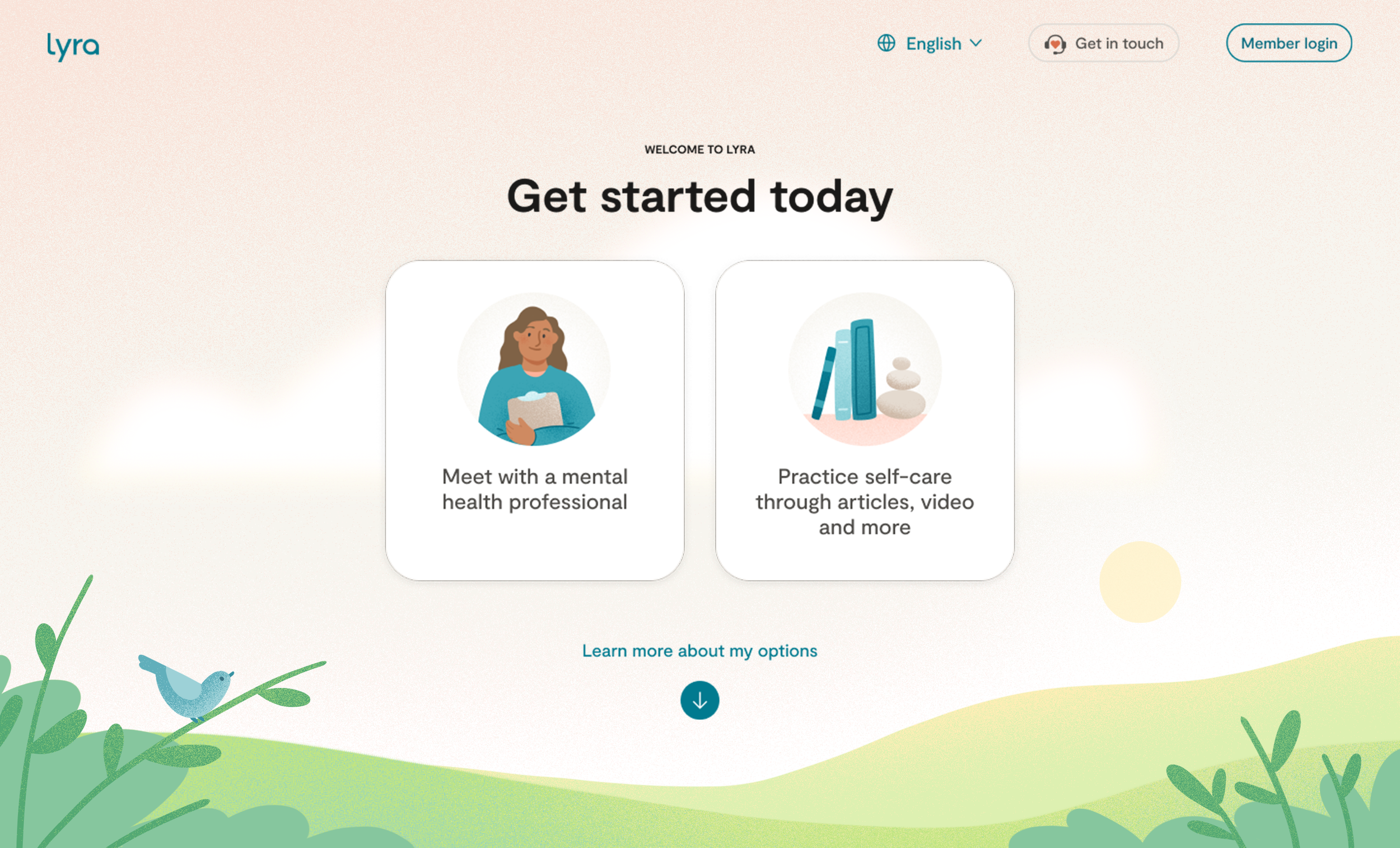
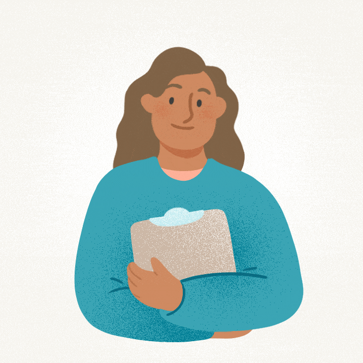
Illustration: Julia Cone
Product Design: Zach Cheung & Elina Lin
Strategy & Approach
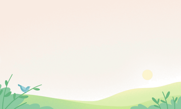
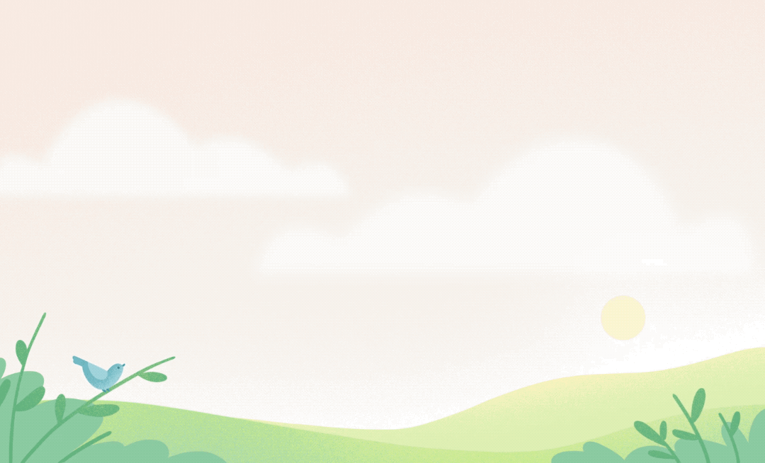
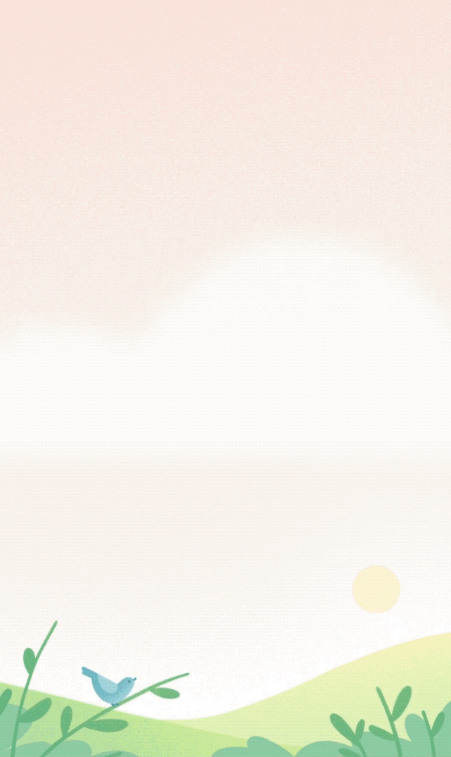
Grounding and calming
Since this was a major entry point at the top of the funnel, the creative team collaborated to craft a serene landscape that could help a member feel calm upon landing on the page. The illustrations were whimsical and delightful, utilizing brand colors and the established illustration style. As part of the large-scale effort for this project, we planned from the beginning of the illustration stage to optimize it for animation and motion interaction. The creative approach was a collaborative effort and ensured what still needed to be editable for the next stage, adding animation and bringing the scene to life.
Animated Background
Most of the animation efforts went to breathing life into the background. The general approach was to emulate a soft breeze in the scene, with the clouds passing by, adding to the calming feeling desired for this experience. The ambient animation was built to loop, having the clouds complete a full cycle across the screen before starting again. There were a few iterations to help break up the timing by adding other easter egg moments of delight in the animation, like the bird flying off and coming back on the branch.
Seeing some of the more active animation concepts in situ with the UI on top ultimately distracted from the main task at hand. So, to prioritize easier navigation, I simplified the animation to be ambient and play a supporting role in the overall hero experience. The other requirement for this visual asset was to ensure there were various versions that accounted for different screen sizes across desktop, tablet, and mobile.
Hover Interactions
Since the background was more ambient, it created an opportunity to use the spot illustrations in the navigation cards to make them more engaging. I collaborated with Product Design and Engineering to add a hover state for the cards that would draw attention to these entry points, all leveraging Lottie.